
Milano - Spring 2025
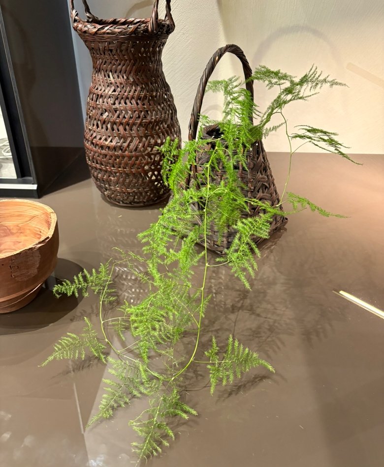
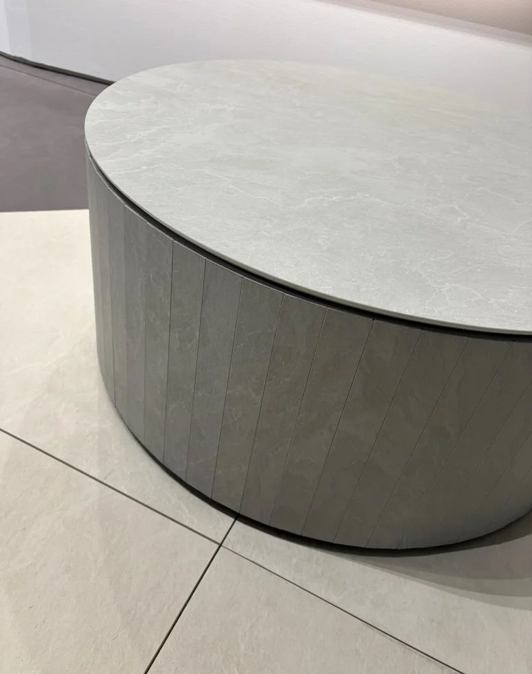
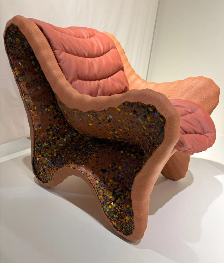
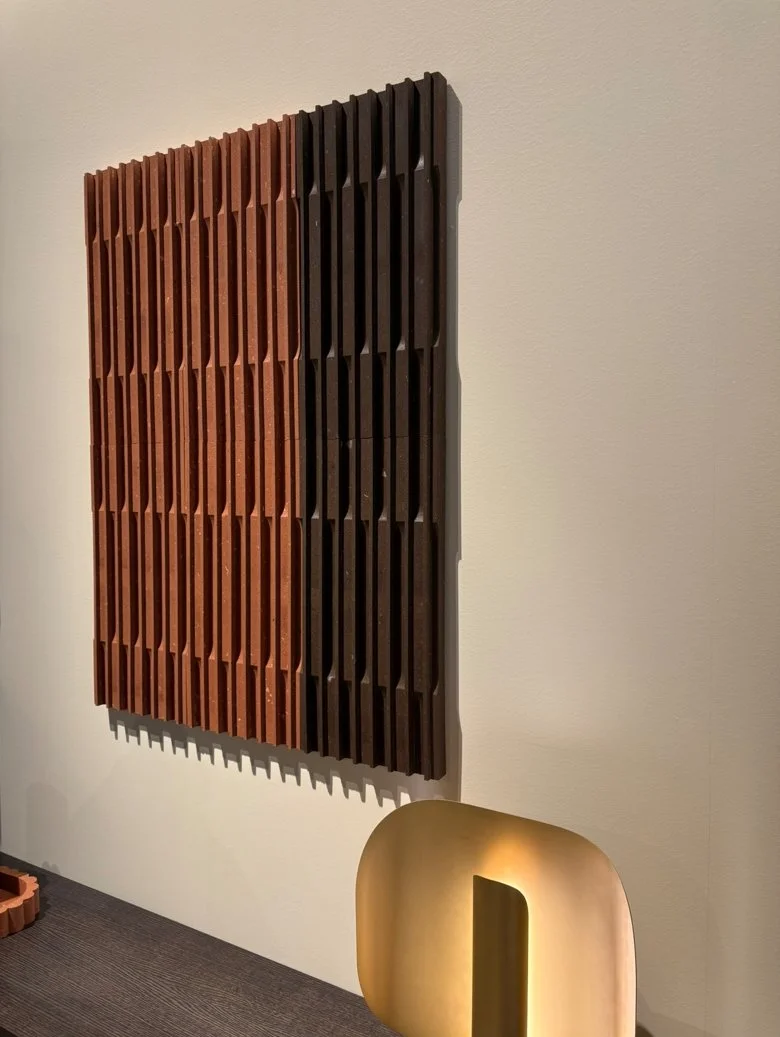
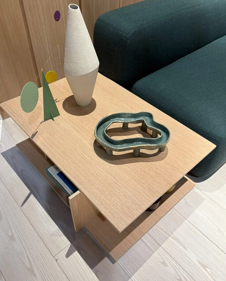
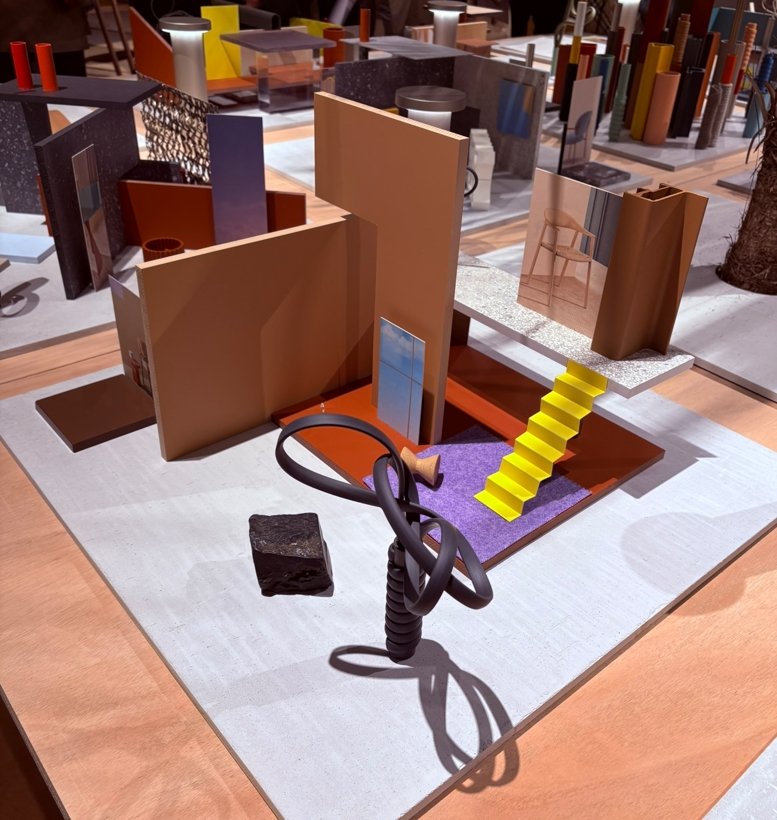
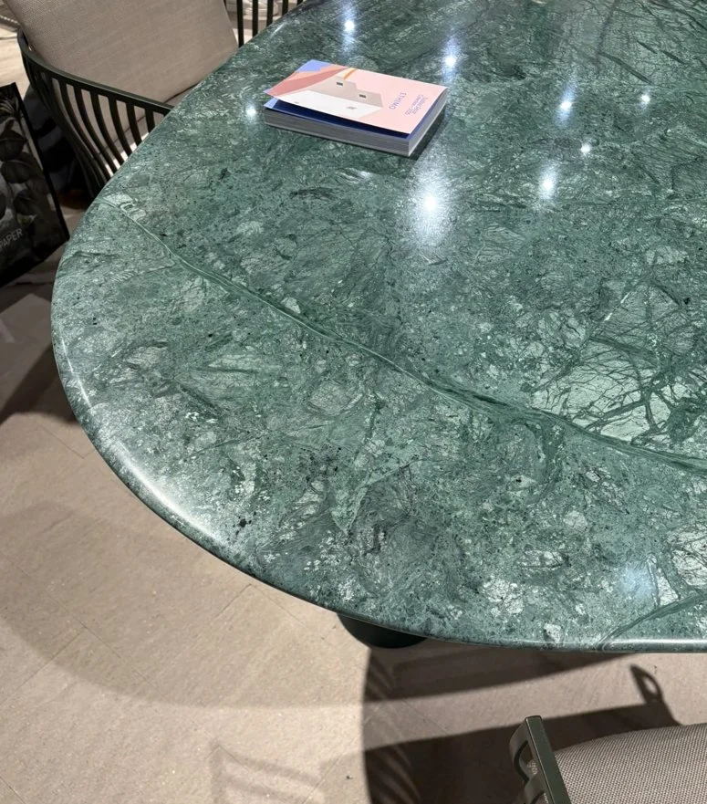
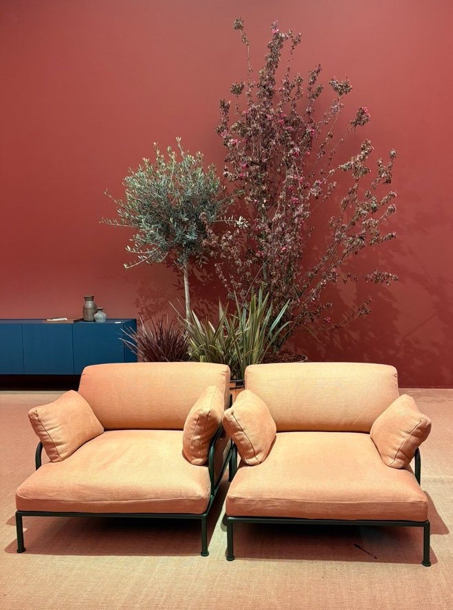
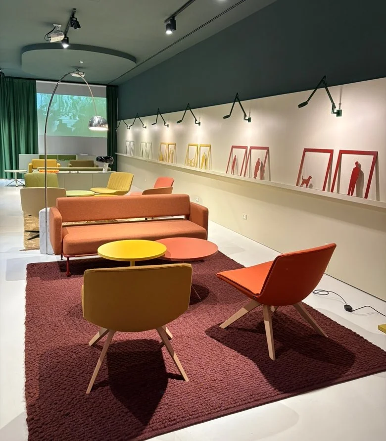
Salone del Mobile 2025 was alive with energy, showcasing bold color palettes, rich textures, and imaginative design. Warm, earthy tones like mocha, terracotta, and deep brown set a grounding backdrop, while flashes of purple appeared in plush leathers and glowing light installations. Fresh accents of mint and deep blue added brightness, and nature-inspired palettes of greens, blues, and soft neutrals blended beautifully with materials such as travertine and green marble. Organic forms, playful silhouettes, and layered transparencies shaped much of the visual language, with subtle nods to the ’60s and ’70s seen in sculptural lighting, bronze, walnut, and cast glass. More than just objects, many presentations aimed to create emotional, multisensory experiences, spaces designed to be felt as much as seen. Together, the fair reaffirmed a growing focus on comfort, craftsmanship, and storytelling in contemporary design. Among the many highlights, the showrooms of Arper, Edra, Moooi, and Pedrali stood out as especially memorable.
During my time in Milan, I was drawn back to the Brera Design District. Its cobbled streets, historic buildings, and creative buzz made it impossible not to linger. Wandering through galleries, design boutiques, and cafés, I felt immersed in Brera’s singular blend of art, fashion, and design, an atmosphere that seems to capture the essence of Milan itself.
One memory that sticks with me is not what I saw, but what I missed. On Corso Garibaldi, the Magis showroom was packed while Paul Cocksedge was there that evening, presenting his Squash/Morphed Mirror collection. I have followed his work for a long time, so being able to step inside and simply say hello is among the few regrets from an otherwise inspiring trip.


Yakisugi: The Art, the Misnomer, and the Process
If you're passionate about unique wood finishes or sustainable building techniques, you've probably heard of "Shou Sugi Ban." But did you know that's actually a misnomer? The correct term is “yakisugi,” a centuries-old Japanese technique that's as beautiful as it is practical. In this post, I’ll clarify the name's confusion, explore the traditional process, and explain why yakisugi is relevant as a useful building material.

Yakisugi vs. Shou Sugi Ban: Clearing Up the Name Confusion
In Japan, the traditional method of charring wood is called yakisugi, which means "charred cedar," with yaki meaning burned and sugi referring to Japanese cedar. Occasionally, it's called yakisugi-ita, meaning "charred cedar plank." The term "shou sugi ban," widely used in the West, is actually a mistranslation, a result of misreading Japanese kanji and combining pronunciations in a way that doesn't exist in the language. In fact, most people in Japan wouldn't recognize the term at all. While "shou sugi ban" gained popularity abroad through early translation errors and marketing, using yakisugi is both accurate and respectful of the craft's cultural roots.

The Yakisugi Process: Traditional and Modern Methods
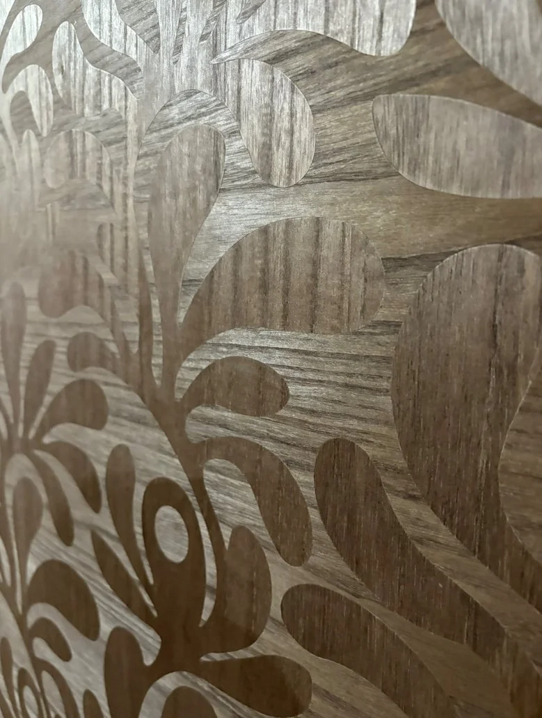
It begins with selecting Japanese cedar, prized for its ideal charring properties. Boards are cut, dried, and then bound together, typically with wet rope or wire, to form a triangular chimney, with the sides to be charred facing inward. A small flame source, such as wood shavings or newspaper, is placed inside and ignited, creating a chimney effect that pulls flames upward for even burning. In just a few minutes, the wood reaches temperatures of up to 600°C. The boards are rotated as needed to ensure uniform charring. Once the desired finish is achieved, the boards are separated and extinguished with water. Finally, the surface is brushed clean, washed, and often sealed with oil to enhance durability and sheen.
Modern Adaptations
Today, many use propane torches for greater control and convenience, especially on smaller projects or when uniformity is key. The steps remain the same: burn, brush, wash, and oil.

Why Yakisugi?
Yakisugi-treated wood is known for its exceptional durability and resistance to the elements. The charring process naturally repels insects and prevents rot while also enhancing the wood’s fire-retardant properties. Visually, it offers a striking aesthetic, ranging from smooth, refined surfaces to bold, textured patterns reminiscent of alligator skin, depending on the intensity of the burn.
Conclusion
Yakisugi is more than a design trend, it's a time-honored Japanese craft with lasting benefits. Often misnamed "shou sugi ban" in the West, the correct term is yakisugi, and using it shows respect for the tradition and culture behind the technique. Whether you're an architect, woodworker, or design enthusiast, understanding its true origins and process deepens your connection to this enduring art form.
Sources:
Japan Woodcraft Association: “Yakisugi (Shou Sugi Ban)” – Explains the correct terminology, historical context, and manufacturing process.
Nakamoto Forestry: “Sustainable Building Material: Yakisugi” and “What is Yakisugi/ Shou Sugi Ban?” – Details the traditional and modern yakisugi process, wood selection, and sustainability.
The Spruce: “What Is Shou Sugi Ban (Yakisugi)?” – Discusses the meaning of yakisugi, process steps, and qualities of the finished wood.
Goodland: “An Exploration of Yakisugi” – Outlines the traditional charring method and finishing steps.
Wikipedia: “Yakisugi” – Provides an overview of the technique, etymology, and benefits.
Pioneer Millworks: “The History of Shou Sugi Ban: Yakisugi” – Offers historical background and cultural context.
Nakamoto Forestry UK: “The Cultural Origin of a Centuries-Old Tradition” – Describes the origins, evolution, and cultural significance of yakisugi.
ArchDaily: “Carbonized Wood: A Traditional Japanese Technique That Has Conquered the World” – Notes the adaptation and popularity of yakisugi in modern architecture.
Understanding Color Metamerism: Types and Their Impact on the Perception of Color
Metamerism is a fascinating phenomenon in color science where two objects appear to match in color under certain conditions but reveal their differences when those conditions change. Understanding the various types of metamerism is crucial for anyone working with color, whether in design, manufacturing, or scientific research, because it helps explain why colors that seem identical in one context may look completely different in another. In this post, I’ll guide you through the different types of metamerism, highlighting what causes each one and why they matter in real-world applications. By the end, you’ll have a basic understanding of how lighting, viewing angle, observer differences, and even technology can all influence the way we perceive color matches. To help visualize these concepts, I collaborated with ChatGPT to generate a series of custom illustrations that demonstrate each type of metamerism in a clear and engaging way.
Illuminant Metamerism:
This phenomenon occurs when two objects that appear the same color under one type of lighting look different under another. This happens because their surface colors are made up of different spectral reflectance profiles, meaning they reflect different wavelengths of light in unique ways. Under the 6500K light source, these differences are masked, but under the warmer 5500K, the light interacts differently with each surface, revealing mismatched colors. In the image below, although the spheres are physically identical, the change in lighting exposes this hidden difference in how they reflect light.

Observer Metamerism:
Observer metamerism occurs when two people perceive the same color differently, even under identical lighting conditions. This variation stems from individual differences in human vision, such as cone cell sensitivity, age-related changes in the eye, or even color vision deficiencies, which influence how colors are interpreted. For instance, one person might see a sphere as greige, while another sees it as slightly warmer or cooler in tone, despite both viewing the exact same material under the same light. This makes consistent color communication especially challenging in fields like design and manufacturing, where precise color matching is essential.

Geometric Metamerism:
This occurs when identical materials appear to differ in color due to their shape and orientation relative to a light source. In this image, the sphere, pyramid, and cube are all made from the same white material, but appear different because each reflects light in a unique way, illustrating how geometry alone can influence perceived color.

Field-size Metamerism:
This image illustrates where two colors that appear identical in small areas begin to look different when viewed over larger areas. Although the gray circles on both panels are the same color, their differing sizes can cause a subtle shift in perceived hue or brightness due to the way our eyes process color across different parts of the retina. This effect highlights how scale alone can influence color perception, even when the material and lighting remain constant..

Device Metamerism:
This phenomenon occurs when the same color, defined by identical RGB values, looks noticeably different across various digital displays. Imagine someone shopping online for a piece of furniture: on their smartphone, the fabric appears vibrant and rich; on their tablet, the same fabric looks more subdued, with cooler undertones. When the furniture finally arrives and is seen in person, the color reveals nuances that weren’t visible on either screen.
These shifts happen because each device interprets and renders color uniquely, influenced by factors like screen calibration, display technology, and ambient lighting. As a result, what should be a consistent color instead appears to change from one device to another..

Other types of color metamerism include sample metamerism (due to differences in material or dye composition), texture metamerism (caused by surface variations like gloss or matte), fluorescent metamerism (from fluorescent agents reacting to specific lighting), and polarization metamerism (differences under polarized light). Adjacent color metamerism results from shifts caused by surrounding colors, while moisture and temperature metamerism occur when color matches change with wetness or temperature.
Sources:
Wikipedia: Metamerism (color)
Coltechcon: At least 12 Color Metamerism types
Metro Dyeing: Understanding Metamerism: A Key Phenomenon in Color Matching
GTI Graphic Technology Inc.: What Is Metamerism?
Carboline: Metamerism in Color Matching for Industrial Coatings
Sculpting with Bricks: Inside The Art of the Brick Exhibition
I had the wonderful opportunity to visit The Art of the Brick at The Franklin Institute in Philadelphia, a captivating exhibit by artist Nathan Sawaya, who transforms millions of LEGO® bricks into over 100 striking sculptures. The show features reimagined masterpieces like Starry Night and Mona Lisa, alongside originals such as the iconic Yellow and his largest piece to date, Decisions, made from over 112,000 bricks.
A standout moment for me was PERNiCiEM: The Endangered Species Connection, a powerful collaboration with photographer Dean West, pairing large-scale LEGO sculptures of endangered animals with compelling imagery to raise awareness about extinction.
The exhibit wraps with a massive interactive play zone, inviting visitors of all ages to get hands-on with thousands of LEGO bricks, a perfect finish to an inspiring experience.


KUSAMA: Cosmic Nature Exhibit
This remarkable exhibition at the New York Botanical Garden beautifully blended Yayoi Kusama’s iconic visual language with the serenity of the natural world. Spanning 250 acres, KUSAMA: Cosmic Nature showcased monumental sculptures, immersive installations, and interactive works like Narcissus Garden and the Infinity Mirrored Room. Kusama’s signature polka dots, bold florals, and whimsical forms transformed the landscape into a dreamlike, multisensory journey. Inspired by her childhood in a seed nursery, the exhibition explored themes of growth, transformation, and our deep connection to nature’s infinite rhythms.


Testing Color Perception: The Ishihara Test
As a color nerd, I can’t help but wonder just how finely tuned my own color sensitivity really is. Can I really see colors well enough to speak confidently about them in my design work? With my love for all things Japanese, especially tools and stationery, I decided to add the 24-plate version of the Ishihara test, created by Dr. Shinobu Ishihara, to my collection.
The Ishihara test is a classic way to check for red-green color blindness. It uses plates covered in colored dots that form numbers or squiggly lines. Depending on your color vision, you’ll either see the shapes clearly or not at all. The test comes in different sizes, from as few as 12 plates up to 38 in the full version.
To take the test, you cover one eye and look at each plate from about an arm’s length away in good natural light. You read out the number or trace the line you see. Most people with normal color vision will see all the shapes, but those with color blindness will miss some or see different numbers.
After going through the plates with both eyes, you count how many you got right. If at least three plates are incorrectly identified, it suggests a color vision deficiency. Having the Ishihara test on hand has helped me better understand how others might perceive color and reminds me always to consider color accessibility in my work.

Sources:
Wikipedia: Ishihara test – Overview of the Ishihara test, its history, creator Dr. Shinobu Ishihara, and details about the plates and test procedures.
Wikipedia: Shinobu Ishihara – Biography of Dr. Shinobu Ishihara, including his medical background and the creation of the Ishihara test.
Colblindor: Ishihara’s Test for Colour Deficiency – 38 Plates Edition – Description of the test, its versions, and its continued use worldwide.
Colormax.org: Ishihara Test for Color Blindness – Information about the Ishihara test, its purpose, and online testing options.
Colorlitelens: Ishihara Test – Explanation of the test procedure and online plate viewing.
Wikipedia: Color blindness – Context on color blindness, its prevalence, and the use of the Ishihara test for diagnosis.
Wikipedia: Color vision test – Information on different types of color vision tests, including the Ishihara plates and their application.
Colblindor: Ishihara 38 Plates CVD Test – Access to the 38-plate version and background on the test’s popularity.